2023 | NLI
The NLI (National Library of Israel) catalogue search interface got a revamp to make searching easier. We tackled the pain points of users having to sift through tons of info, functions like 'expand' and 'get item' not being easy to find, and the challenge of understanding item accessibility status.
Our main goals were to add more features for researchers and share more item details, like file count, accessibility status, and full-text availability. We wanted to make it effortless for users to scan results, minimize mental effort, and maintain a consistent design look using NLI's new design system.
This was a long and complex process, here I'll show you two main issues we had to tackle.
Try it here.
My role
Product design lead
Services
UI & UX Design
Design system
The Team
Danny Streifler
Einat Eidelman
Timeline
14 months
Looking for a change
With the library moving to a new building and design, we decided to address several usability issues and enhance functionality.
Main pain points
1
Adapting the old search interface to the new design system while keeping all essential information
2
Users struggled to interpret file accessibility and additional details
3
New features needed a clear hierarchy to avoid clutter and improve navigation
Our Mission
Revamping the library’s search experience with a clear, intuitive design and added functionalities to enhance user navigation and content accessibility.
UX Goals
Integrate the search interface into the new design system while maintaining clarity
Improve visibility of file accessibility and additional details
Organize new features to enhance browsing without clutter
The process

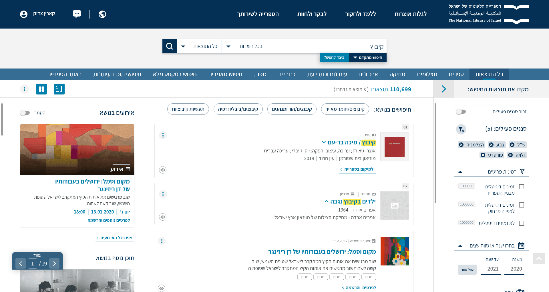
Design exploration of information-heavy results
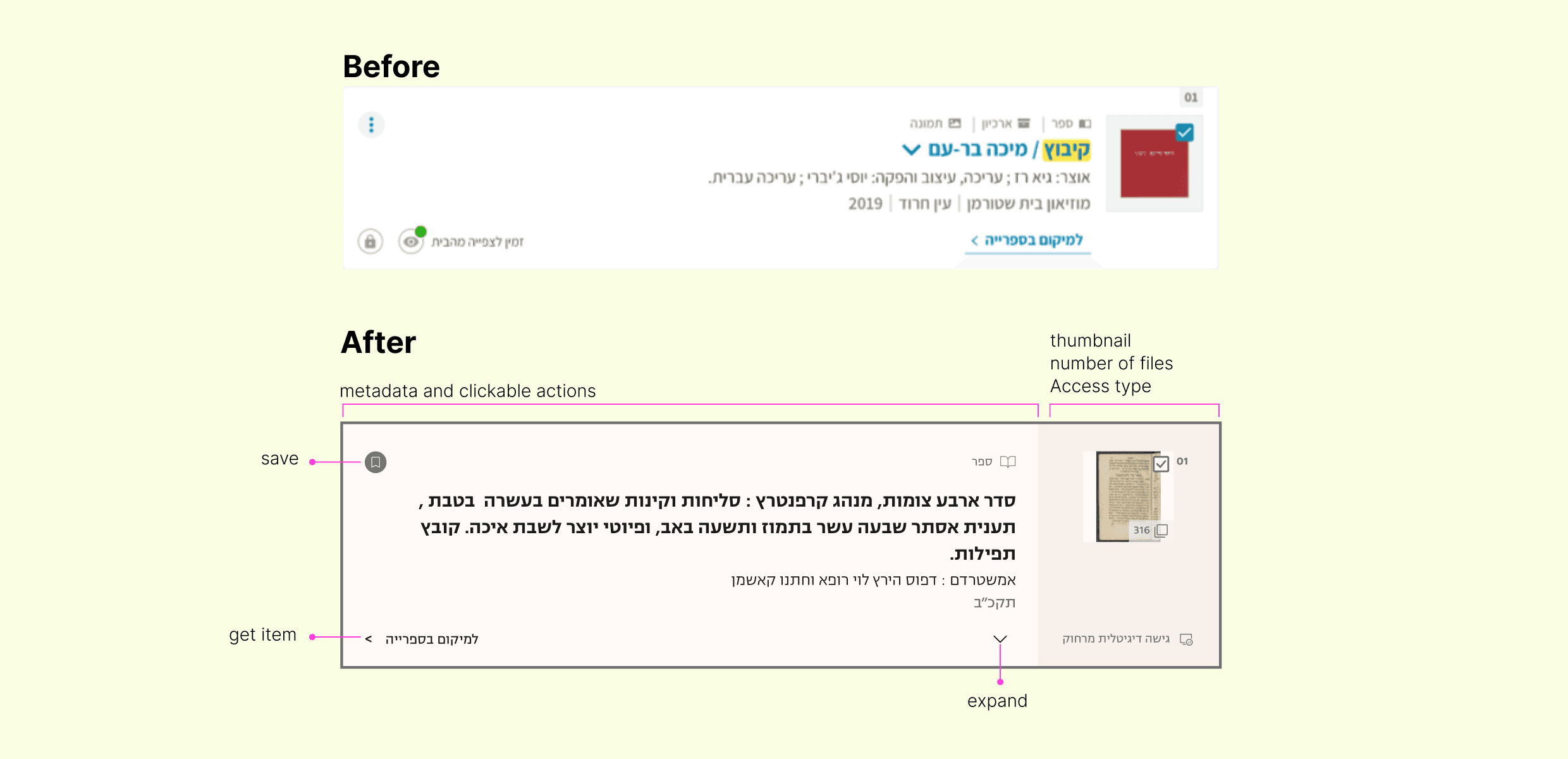
A detailed overview of the hierarchy of search results, including the structure before and after modifications.
Making it simple
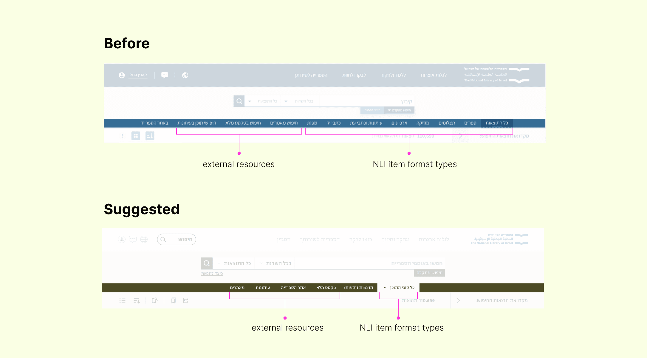
Proposed design for the formats menu. This design was not approved for the final version.
Smarter search experience
In the end, the redesigned interface successfully integrated more information and functions while keeping things easy for users to process. Our use of a grid, typography, and color hierarchy aimed to make it a breeze for researchers to find what they need, quickly.
If you're curious about more aspects and challenges of this project don't hesitate to drop me a line.
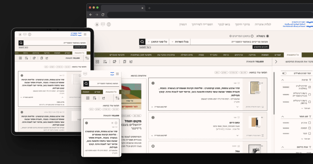
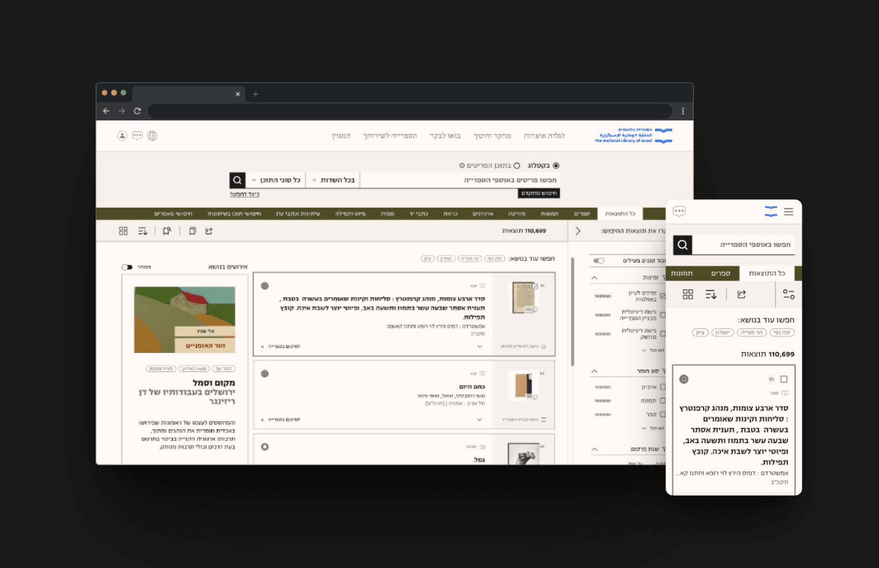
Final result, a responsive design in 3 languages
3%+
Use of the formats bar
15% +
queries per session, filter usage, and click-through rates, indicating improved usability.
Boosted key actions
from search results by 10%, demonstrating a more effective discovery experience.

