2023 | NLI
The National Library of Israel (NLI) is a center of knowledge and culture, dedicated to preserving the treasures of the Jewish people and Israel.
This case study explores the creation of NLI’s design system, detailing the challenges, development process, and results of building a scalable and cohesive digital experience.
My role
Product designer
Services
UI & UX Design
Design system
The Team
Einat Eidelman
Timeline
Ongoing
Facing a big change
Despite its rich history, the old library's design no longer met modern user expectations. Located within the Hebrew University campus in Givat Ram, it primarily served academics, with a compartmentalized layout that limited public accessibility.
Digitally, the old design featured three breakpoints—desktop, mobile, and tablet—but felt outdated. Its rigid grid, blue-toned color scheme, and reliance on NLI’s logo elements lacked flexibility. Sub-brands and outsourced projects often deviated from the core identity.
By 2023, with the library preparing to move into a new building and redefine its role, it became clear that a fresh, cohesive design system was essential.
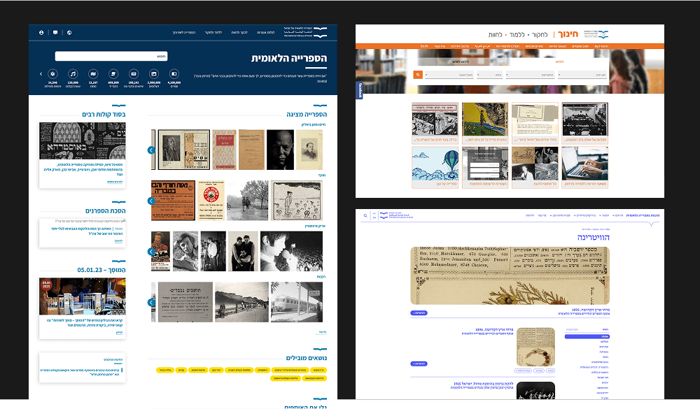
The Old Library: Fragmented Design & Branding
Despite its rich history and academic significance, the old library's physical and digital experiences felt disconnected from modern user expectations.
Challenges
1
Aligning with NLI's new branding - clean, innovative, and accessible.
2
Creating a system that serves library stakeholders rather than just being a well-designed document.
3
Designing a scalable system that evolves alongside the library and its expanding content.
Our Mission
Building a scalable and cohesive design system to streamline processes.
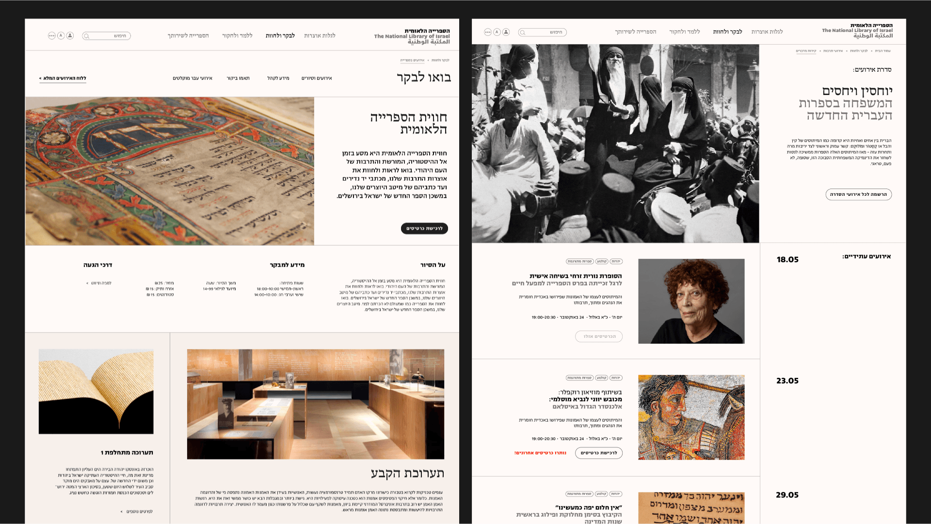
The new library was designed to be both impressive and accessible. Its open, spacious structure allows visibility into the building’s activities, reinforcing transparency and engagement.
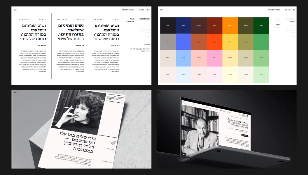
The new branding reflects a magazine-like aesthetic - clean, minimalistic, and structured. The color scheme consists mainly of whites and grays, accented by fine lines. The grid system is typically divided into thirds or quarters, with images and a secondary palette introducing color.
We received an initial style-guide from Rotem Cohen, which served as a foundation for extracting the atomic components of the system.
First web pages designed with the new style-guide

The new library building
A few details from the brand book
Building the Initial System & Transitioning to Figma
The first version of the design system, created in Adobe XD, focused on fonts, colors, and basic card components, with plans for future expansion. Recognizing the need for greater collaboration between teams, we transitioned the system to Figma.
This shift was accompanied by structured meetings with the product and development teams to define the system’s architecture and ensure its seamless integration into workflows.
Who will use this?
Product team
Dev team
Outside collaborators and stakeholders
Implementation & Collaboration
To ensure successful adoption, we established clear design principles, shared branding assets, and presented the design system transparently. Collaboration remained key, with open discussions to refine and evolve the system.
One example is our work with Deloitte - before providing them with finalized designs, we shared wireframes. They later made adjustments based on our system and, where applicable, used existing components.

Color primitives and card examples
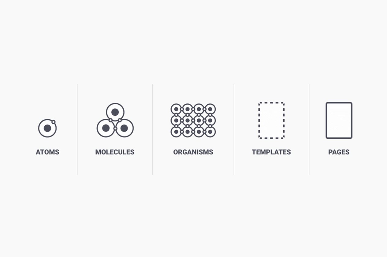
Using atomic design principles
Results & key takeaways
A fully documented design system supporting NLI’s website in three languages and across four breakpoints.
Adoption by both product and development teams, ensuring consistency across digital experiences.
The system serves as a foundation for scaling NLI’s design across future products.
Creation of core files, documentation, and design patterns to support users in navigating, developing, and expanding the system.
This design system is not just a tool - it’s an evolving framework that ensures NLI’s digital presence remains consistent, scalable, and true to its vision.

