2024 | NLI
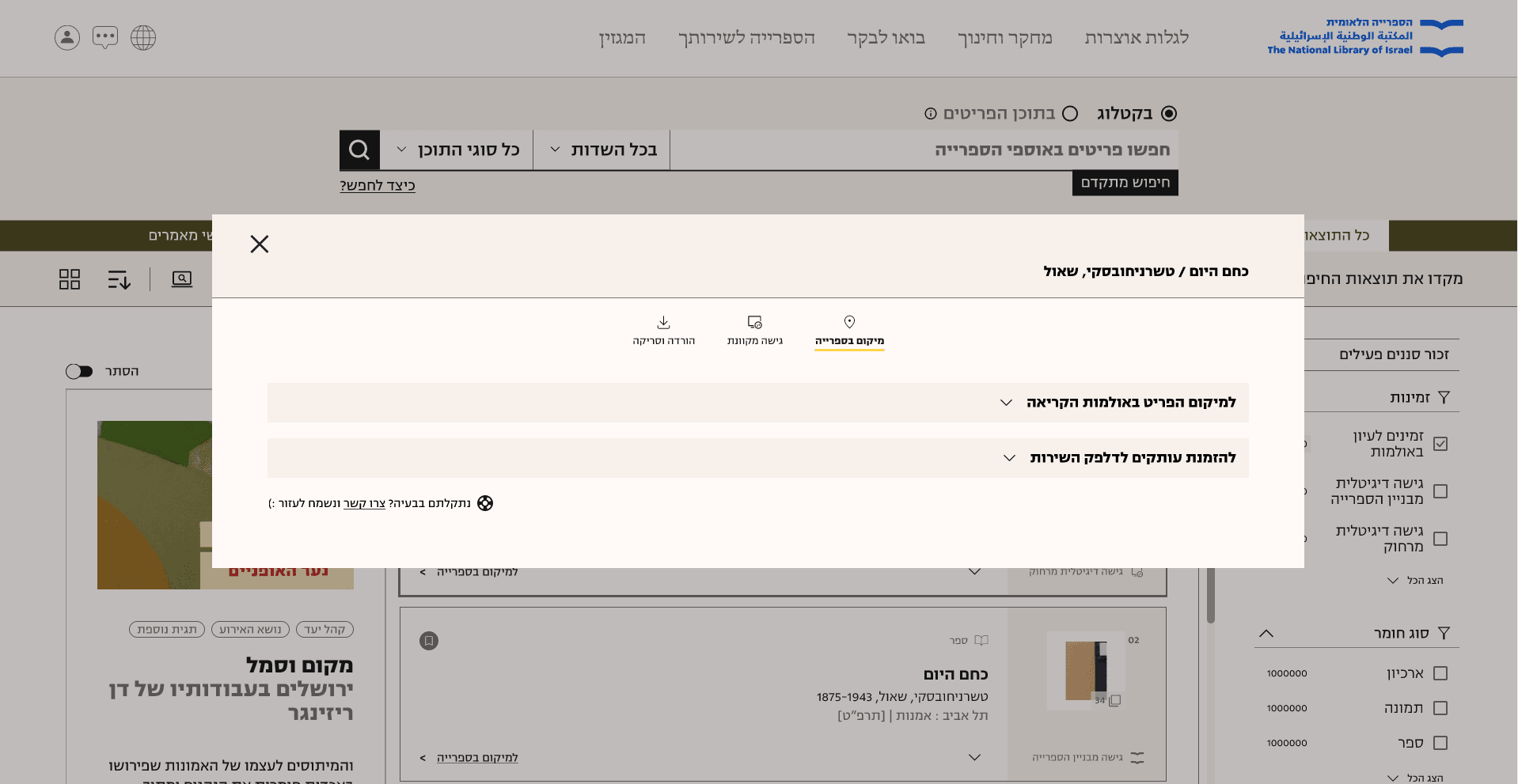
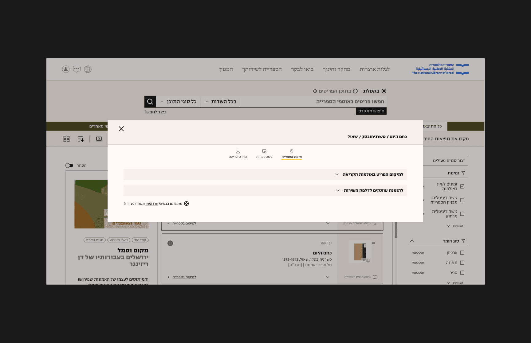
In this case study, I will share how we redesigned the NLIs order window. Our goal was to help users find the materials they are looking for quickly. We overhauled the modal to align with the library's new design system and added additional options for accessing information. This project was overseen by Nathan Hirsch. You can test it here.
Challenges
Users found it difficult to access certain items like ordering a scan or download.
Users were not aware of all the ways to find an item.
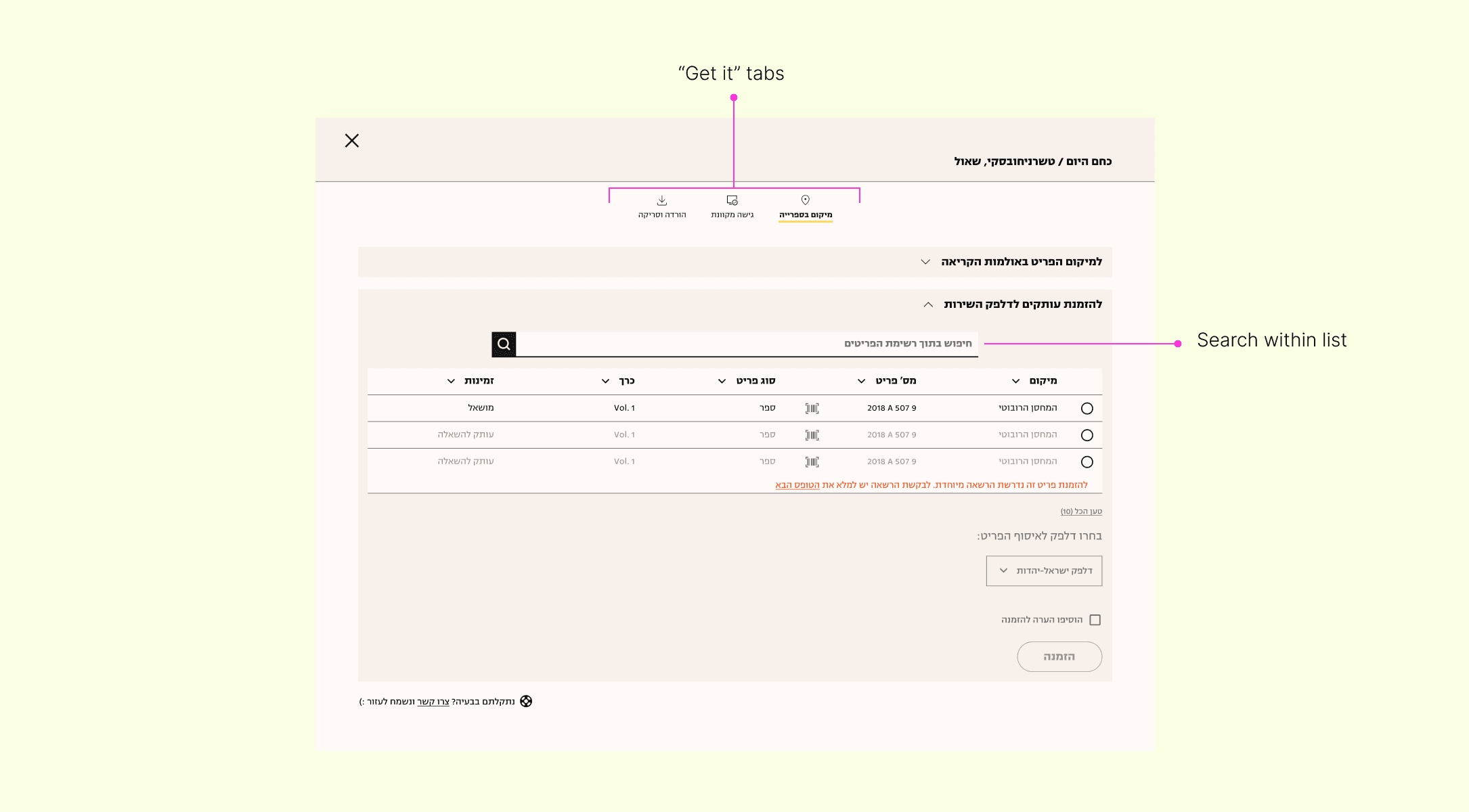
The "Search within copies" feature was not visible.
Users found the order status confusing.
Goals
Display all the ways to find an item.
Help users sort through results.
Make all options clear for users to choose from.
My role
Product designer
Services
UI & UX Design
Design system
The Team
Dana Aroetti
Timeline
8 months
Our Mission
Pain points
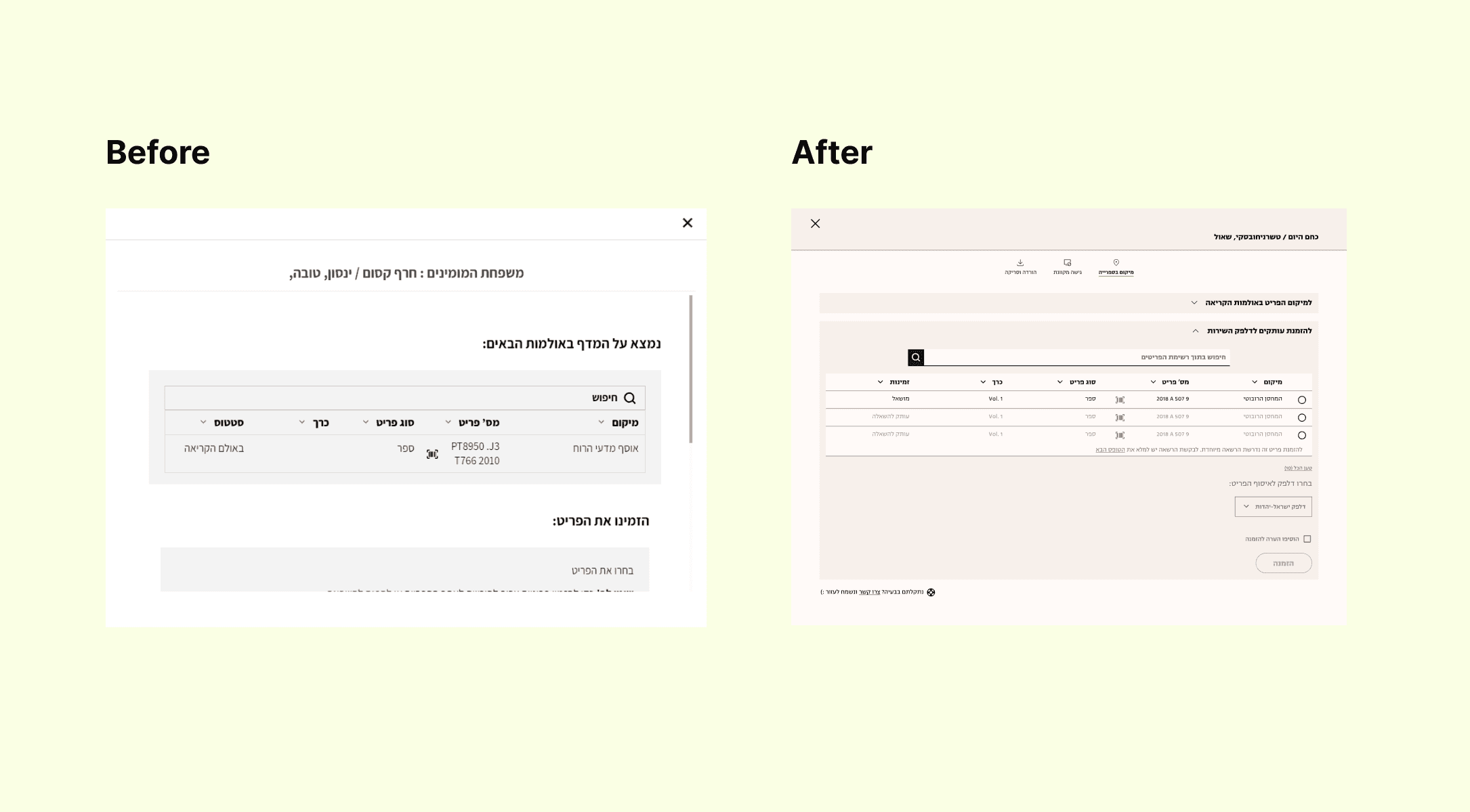
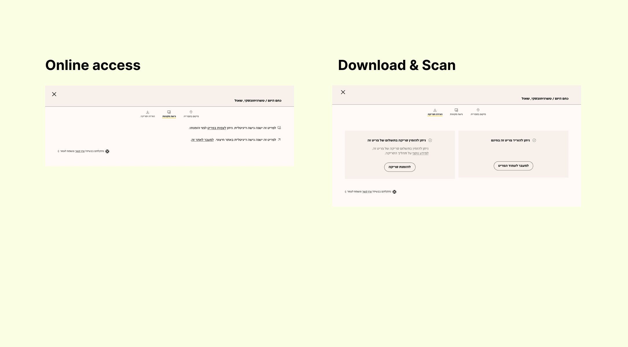
Adding options and reorganizing
In the process, we made several improvements to the order window. We added tabs for different ways to find an item, organized "find" and "order" into collapsible sections, improved the visibility of the search bar, and made some changes to the text. These changes were aimed at making it easier for users to choose how to find and access the information they need.
UX Goals
The Process
Canvas, April 2022
Result
The result of our efforts is that the new order window has significantly improved the speed and ease with which researchers can find and access the information they require. With the implemented changes, users can now efficiently navigate through the various options to retrieve their desired materials, ultimately leading to a more seamless and satisfying user experience.